
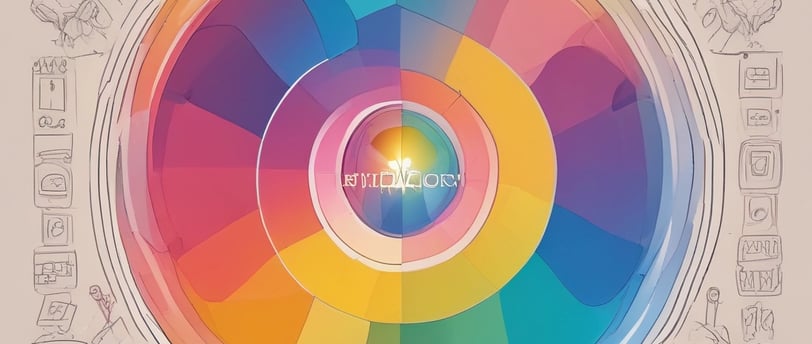
Stride Zero Success Starts With Color: The Psychology Behind Winning Brand Palettes 2025
In today's attention economy, consumers form brand impressions in milliseconds—with color driving 90% of snap purchasing decisions (2024 Color Psychology Report). At the critical identity-formation stage, strategic color combinations become a brand's silent ambassador, influencing: 80% greater recognition (Loyola University) 90% of initial product assessments Instant differentiation in crowded markets 2025's most successful brands won't just choose colors—they'll engineer palettes that work psychologically at lightning speed. It's not about looking good—it's about triggering the right subconscious associations before competitors even get noticed.
COLOR PSYCHOLOGY IN BRANDINGEMOTIONAL CONNECTIONCOLOR THEORY IN MARKETINGCOMPETITIVE DIFFERENTIATION2025 COLOR TRENDSDUOTONE BRANDING TRENDSTRIDE ZERO MARKETING
In a world where consumers make snap judgments, colors influence up to 90% of purchasing decisions (according to a 2024 Color Psychology Report).
At Stride Zero Marketing (the initial stage where a brand establishes its identity), choosing the right color palette isn’t just about aesthetics—it’s a psychological and strategic decision that influences perception, recall, and differentiation. One of the most powerful yet often overlooked tools for differentiation? Strategic color combinations.
Research shows that color increases brand recognition by up to 80% (University of Loyola), and 90% of snap judgments about products are based on color alone (Impact of Color on Marketing). In 2025, as brands fight for micro-moments of consumer attention, the right color palette can make or break your identity.
1. The Psychology of Colors in Branding
Color is far more than a visual element—it’s a silent communicator that shapes how consumers perceive and connect with brands. Each hue carries psychological weight, triggering instinctive emotional responses that can sway purchasing decisions.
Consider how industry leaders strategically harness color psychology:
Red commands attention, stirring urgency (Coca-Cola’s bold vibrancy) and passion (Netflix’s cinematic intensity).
Blue radiates trust and dependability, explaining its dominance among tech giants (Facebook’s connectivity ethos, LinkedIn’s professional tone).
Green embodies renewal and eco-conscious values, aligning with brands like Starbucks (earth-friendly positioning) and Whole Foods (natural vitality).
Yellow bursts with optimism, fueling McDonald’s cheerful identity and Snapchat’s playful energy.
Black exudes sophistication, underpinning Chanel’s timeless elegance and Mercedes-Benz’s premium craftsmanship.
The 2025 Evolution: Forward-thinking brands are transcending monolithic color schemes, instead crafting strategic duos and trios that balance striking contrast with cohesive harmony. This shift reflects the need for deeper emotional resonance in an oversaturated digital world—where color combinations now serve as layered storytelling tools.
Example: A luxury skincare brand might pair sleek black (prestige) with soft gold (warmth), while a Gen Z-focused app could combine electric purple (creativity) with acid green (disruption). The future belongs to palettes that multitask—differentiating brands while conveying nuanced emotional narratives.
2. Why Color Combinations Matter More Than Ever
A solitary color, while evocative, is often insufficient to capture the multifaceted essence of a brand’s identity. Thoughtfully curated color pairings, however, serve as a dynamic language—one that achieves three critical objectives in today’s visually saturated marketplace:
Cutting Through the Noise
In a sea of competitors, distinctive color combinations act as visual shorthand for brand recognition. Dunkin’s playful fusion of pink and orange, for instance, creates an energetic contrast to Starbucks’ monolithic green, ensuring instant differentiation in the crowded coffee sector.Embedding in Memory
The human brain retains visual information more effectively when colors interact in unexpected yet harmonious ways. Instagram’s signature gradient—a fluid transition from purple to pink—demonstrates how chromatic progression can become synonymous with a brand, leaving an indelible imprint on consumer consciousness.Conveying Brand Ethos
Color pairings function as silent storytellers. Patagonia’s marriage of organic greens and blues doesn’t merely appeal aesthetically; it telegraphs environmental stewardship, aligning perfectly with the company’s sustainability mission.
2025’s Defining Color Pairing Philosophies
Neon + Neutral
The juxtaposition of electric vibrancy against muted backdrops (exemplified by Glossier’s millennial pink against crisp white) mirrors the modern consumer’s duality—craving bold self-expression while valuing minimalist sophistication.Retro Gradients
Spotify’s duotone aesthetic revitalizes vintage color-blocking with contemporary flair, proving that nostalgia can feel cutting-edge when recontextualized for digital spaces.Earthy Tones + Bold Accents
Patagonia’s strategic use of fiery red punctuations within its natural palette demonstrates how restrained color schemes can project stability while still commanding attention—a visual metaphor for brands balancing tradition with innovation.Dark Mode Aesthetics
Apple’s embrace of deep blacks paired with metallic accents reflects a broader cultural shift toward sleek, eye-friendly interfaces—transforming what was once purely functional into a statement of modern luxury.
These emerging paradigms reveal a fundamental truth: in 2025, color will no longer be merely seen—it will be experienced as an active participant in brand storytelling. The most successful palettes won’t just decorate a logo or package; they’ll create immersive sensory worlds that resonate on both emotional and subconscious levels.
The question for forward-thinking brands isn’t simply which colors to use, but how their interplay can become an authentic extension of corporate identity in an increasingly visual-first economy.
3. How SMEs Can Leverage Color Psychology
For small and medium enterprises, color psychology isn't just about aesthetics—it's a strategic tool for carving out market space. The process begins with competitive analysis: studying rivals' palettes to identify chromatic white space. When competitors default to corporate blues, for instance, blending teal with gold can create immediate differentiation while maintaining professionalism.
Modern brands must embrace digital-first testing methodologies. Platforms like Coolors and Adobe Color transform color theory into actionable strategies, allowing SMEs to experiment with contrast combinations before public rollout. These digital tools democratize what was once the domain of large design teams.
The most effective palettes serve as visual translations of brand personality. Youthful, disruptive brands might embrace vibrant clashes, while premium services benefit from subdued metallics that whisper exclusivity. Crucially, digital optimization is non-negotiable—WCAG compliance ensures inclusivity while maintaining visual impact.
TikTok's 2025 rebrand offers an instructive case study. Their shift to high-contrast black and neon pink demonstrates how established players refresh identities to maintain cultural relevance. For SMEs, this underscores that color strategy isn't static—it requires periodic reassessment to align with evolving market perceptions and platform requirements. The chromatic choices made today become tomorrow's brand equity.
4. The Future: AI-Generated Personalization
As we approach 2025, artificial intelligence is transforming color strategy from static choice to dynamic conversation. Cutting-edge tools like Adobe Firefly and Canva Magic Design are empowering brands to move beyond one-size-fits-all palettes, instead crafting color experiences that adapt in real-time. These AI solutions analyze audience demographics, emotional responses, and engagement patterns to generate optimized color schemes that resonate at individual levels.
The implications are profound: automatic A/B testing eliminates guesswork, while platform-specific adaptations ensure consistent brand impact across digital touchpoints. Imagine logos that subtly shift hue for Instagram Reels versus LinkedIn posts, or seasonal campaigns where colors evolve based on real-time cultural trends. This isn't just personalization—it's color intelligence at scale.
For forward-thinking brands, AI-driven color represents the next frontier in visual branding. The question shifts from "what colors should we use?" to "how can our palette dynamically reflect our audience's ever-changing preferences?" In this new paradigm, color becomes not just a design element, but an intelligent brand ambassador.
Final Takeaway
"In Stride Zero Marketing, where first impressions form in milliseconds, your color palette acts as a silent yet powerful brand ambassador".
Key Actions:
Audit your current colors—do they stand out or disappear in your industry?
Test emerging 2025 combinations (Neon + Neutral) for cutting-edge appeal.
Leverage AI tools to optimize hues for maximum psychological impact.
Why It Matters:
The right color scheme:
✅ Creates instant brand recognition
✅ Non-verbally conveys your core identity
✅ Secures a unique market position